Platform Architecture
Evolving Configurable Content Sections into a Reusable Layout Engine
Case study overview
- Role
- iOS platform engineer working across reusable UIKit content views, layout protocols, adapters, and legacy section integration.
- Context
- A mature white-label content engine rendering many section styles, content types, and Native Ads through both legacy and compositional collection-view paths.
- Challenge
- Create one predictable measurement and rendering model without forcing a risky rewrite of existing sections or duplicating layout behavior.
- Contribution
- Designed the list-layout protocol, content-section adapter, typed configurations, reusable content-view lifecycles, and compositional-layout translation layer.
- Outcome
- A shared architecture for measurement, layout, rendering, reuse, and Native Ad insertion that could evolve incrementally across the engine.
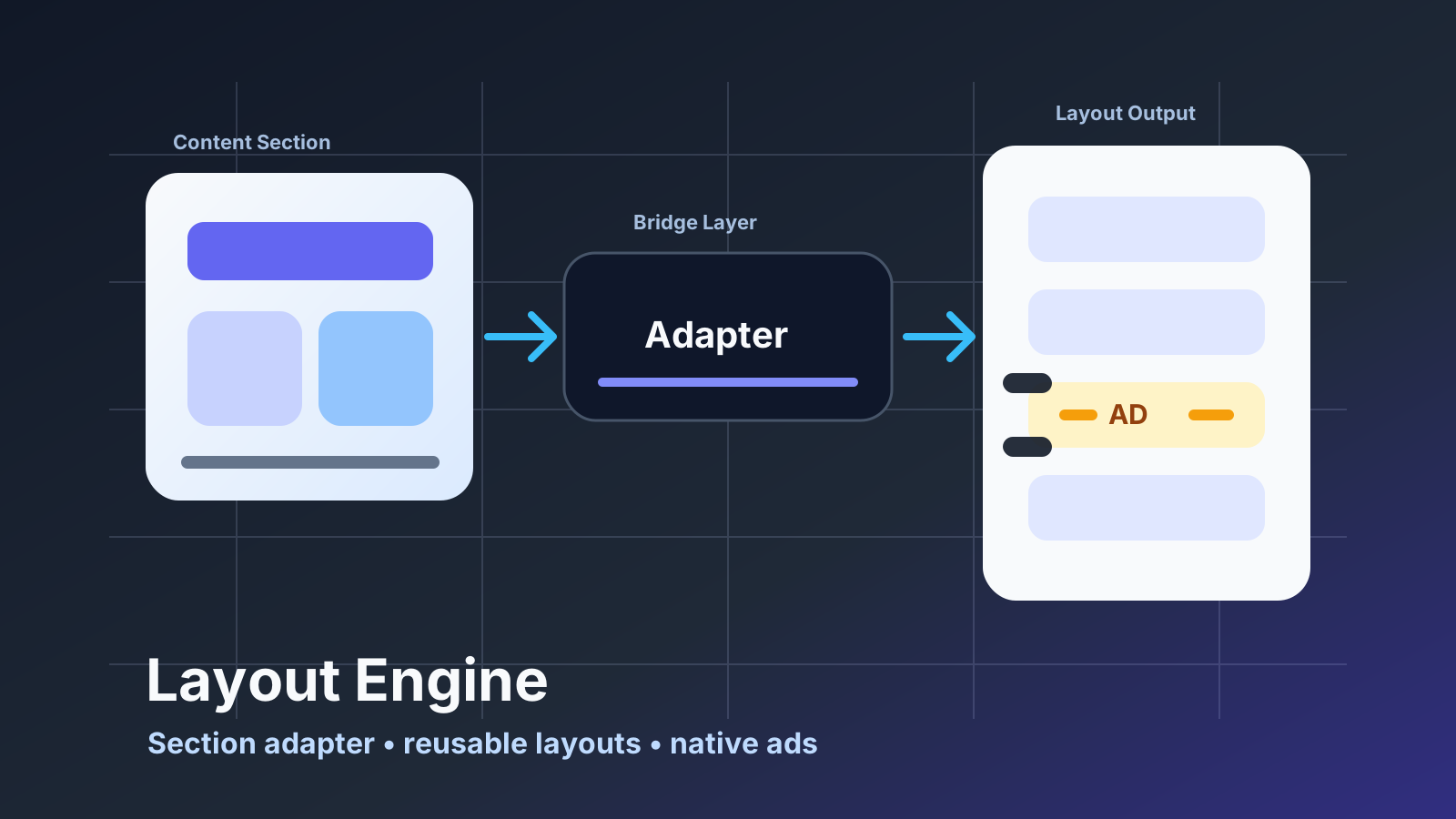
Legacy systems rarely need a rewrite first. Most of the time, they need a better boundary.
That was the mindset behind my work on the layout engine and content-section adapter architecture in the iOS engine. The app already had years of configurable section behavior, templates, content types, design settings, and production expectations. The goal was not to throw that away. The goal was to create a modern layout layer that could coexist with the existing system and gradually make it easier to build new templates.
This work became even more interesting when Native Ads had to be integrated into the same system. Ads could not be treated as a separate screen-level hack. They needed to participate in the layout model like real items, while still preserving content indexing, sizing, selection, and visual consistency.
The Context
GoodBarber apps are generated from configuration. What the legacy engine historically called a widget is closer to a configurable content section: a block placed in an app, driven by settings, able to render articles, videos, podcasts, maps, events, and other content types across different templates and design models.
Each content section has to respect:
- content type
- template variant
- margins and padding
- typography
- colors
- shape and shadows
- paging behavior
- horizontal or vertical scrolling
- item sizing
- cell classes
- selection behavior
- cached layout calculations
In a mature engine, every small layout decision can affect many apps. That makes architecture important. If every template solves layout differently, the code becomes hard to maintain and impossible to evolve consistently.
The Problem
The existing content-section system carried a lot of behavior from earlier generations of the engine. It worked, but adding modern layouts meant dealing with legacy assumptions.
I wanted a structure where layout logic could be expressed through a reusable protocol instead of being scattered across legacy section subclasses. A layout should be able to describe what it needs:
- which cell classes it uses
- how many items it displays
- how it calculates item size
- how it computes frames
- how it configures cells
- how it handles margins, padding, paging, and selection
At the same time, the rest of the engine still expected a legacy Widget object. So the architecture needed an adapter.
The Content Section Adapter
The content-section adapter became the bridge between the legacy content-section API and the newer layout engine.
Instead of making each modern layout inherit all the behavior of a legacy content section, the adapter wraps a layout object and exposes the behavior the old system expects. That kept the migration incremental.
The adapter is responsible for connecting the layout to the existing section lifecycle:
- mapping section type to content item types
- exposing cell classes
- forwarding cell configuration
- reporting number of cells
- calculating section size
- managing scroll behavior
- connecting design-model properties to legacy section behavior
This was useful because the new layout layer did not need to become a giant subclass hierarchy. Layouts could focus on layout. The adapter handled compatibility.
That is often the best way to modernize a large codebase: create a boundary that lets new code speak to old code without forcing one side to pretend to be the other.
A Protocol for List Layouts
The layout protocol became the core contract.
It defines what a list layout knows how to do: provide cell classes, calculate item counts, configure cells, compute sizes and frames, expose layout behavior, and manage cache-sensitive calculations.
This gave the engine a common vocabulary for different templates. A condensed layout, enriched layout, visual grid, or story-like layout could implement the same contract while keeping its own design and sizing rules.
The important part was not only code reuse. It was consistency.
When templates share a layout contract, future features can be integrated at the protocol level instead of being duplicated across every template. That matters a lot in a product where new capabilities need to roll out gradually across many designs.
The Complete Rendering Pipeline
The protocol is only one part of the system. The more useful way to understand the architecture is to follow one content item from configuration to pixels.
The engine starts with several independent inputs: a CMS content item, the design model generated from the app configuration, the template selected for the section, and actions such as opening an item, playing media, sharing, or bookmarking. The selected layout combines those inputs into a typed content configuration. The same presentation model is then used twice: first to measure the item, and later to configure the visible collection-view cell.
The complete path is:
- The legacy section lifecycle selects a modern layout through the content-section adapter.
- The layout resolves the visible index to the correct content item and content-view class.
- It builds a typed
UIContentConfigurationfrom the item, design model, and available actions. - A reusable sizing content view applies an equivalent presentation configuration at the target width and reports its height.
- The layout turns the measured dimensions into item frames and a total section size.
- A UIKit layout adapter translates those frames into collection-view layout attributes.
- When the cell becomes visible, the same content configuration creates or updates its content view.

Keeping those stages connected was important. If sizing uses an approximation while rendering uses the real view hierarchy, variable text, media, toolbars, and accessibility settings eventually produce incorrect heights. Here, measurement and display share the same presentation state and content-view implementation.
Typed Content Configuration
The reusable cell layer is based on UIKit’s content-configuration model. Each visual family has a typed configuration containing the data and presentation state needed by its content view: text elements, media, toolbar state, restrictions, design models, and interaction closures.
That creates a useful separation of responsibilities. Layout objects decide which presentation is appropriate and construct its configuration. Content views decide how that configuration becomes UIKit elements. Collection-view cells remain generic containers instead of accumulating template-specific state.
This also makes reuse more predictable. Assigning a configuration to UICollectionViewCell.contentConfiguration gives UIKit a standard way to create the corresponding content view and update it as the cell is recycled. New layouts can reuse an existing content-view family with a different configuration, while a new visual treatment can introduce a new content view without changing the legacy section lifecycle.
The shared reusable content-view base provides the common update process. Its most important rule is that design and item data do not share the same update lifecycle.
Two Update Lifecycles Inside Every Content View
These two lifecycles are separate from the two host integration paths in the previous diagram. They describe how one reusable content view reacts when its typed configuration changes.
The design lifecycle runs through a dedicated design-update hook. It is triggered only when the configuration’s design model changes. This is where the view applies values shared by every item using that design: fonts, colors, spacing, shapes, borders, shadows, element design models, and right-to-left presentation rules.
The item lifecycle runs through a separate item-binding hook. It is triggered whenever the configuration value changes during binding. This is where the view applies data that varies from one item to another: text, image and media URLs, restriction state, toolbar content, visibility flags, and interaction actions.
Keeping those cadences separate has practical performance value. A recycled cell can receive a new article without reapplying an unchanged visual system. Conversely, a design update can refresh presentation through one explicit path instead of being mixed into every content assignment.

The split also creates strict implementation rules. The design-update hook must not read item text or URLs. The item-binding hook must not redo fonts, colors, or shape styling, and it should not perform synchronous parsing, formatting, or image decoding on the scroll path. Content-configuration factories prepare those values before binding.
Reuse makes the item path especially sensitive. Every conditional property must set both states. If one item hides a toolbar or thumbnail and the next item should show it, leaving out the opposite branch preserves stale state from the previous binding.
I also worked on reducing redundant layout work across both paths. Applying one configuration can update several child elements, each of which may request layout. The content-view base batches the operation: it records deferred layout requests while configuration is in progress, then performs one final layout pass when the outer update finishes. Fast reuse therefore avoids a cascade of synchronous layout passes without weakening the separation between design and data.
One View Model for Measurement and Display
Dynamic sizing is where the content-configuration layer and the layout engine meet.
The layouts do not estimate cell height from a handful of constants. They ask the relevant content-view type to create a sizing instance, apply an equivalent presentation configuration, constrain it to the calculated width, and return its computed height. Interaction closures can be omitted because they do not affect geometry. This accounts for the actual combination of title length, optional metadata, media, toolbar content, and design settings.
Creating a new sizing hierarchy for every item would be wasteful, so layouts retain a reusable sizing content view. When the next item uses the same content-view type, the layout applies the new configuration to that instance instead of allocating another hierarchy. If a mixed layout switches to a different cell family, it replaces the sizing view with the required type.
This choice made sizing more accurate without making it disconnected from runtime performance. It also gave new templates a repeatable implementation pattern: define the configuration, implement the content view’s height calculation, and let the shared layout contract handle the rest.
Translating the Engine into Compositional Layout
The layout protocol deliberately describes geometry without depending on one collection-view layout implementation. A compositional-layout adapter is the bridge that translates that geometry into UIKit’s compositional-layout system.
For a given container size, the adapter asks the layout for every cell frame and creates custom compositional-layout items. It then wraps those items in a group sized from the layout’s total content height. The layout remains responsible for template rules such as columns, variable row heights, spacing, and padding; UIKit remains responsible for collection-view integration and presentation.
A collection-view integration layer completes that connection. When a list layout is assigned, it registers the required cell classes and supplementary views, connects the adapter to the collection’s data source, and installs the generated compositional layout. This gave existing sections a focused entry point for adopting the new engine.
I also extended the compositional layout to represent section-level presentation that does not belong inside an individual cell. Backgrounds, separators, and shadows receive their own supplementary layout attributes and z-ordering. This keeps cell content focused on the item while the section layout owns the visual treatment around the collection as a whole.
The same protocol could also be consumed by a custom flow-layout adapter. That was a useful architectural check: the layout rules were not hidden inside compositional-layout callbacks. They remained portable geometry and configuration decisions, with UIKit-specific adapters on the outside.
Native Ads as First-Class Layout Items
Native Ads made the architecture more interesting.
The product requirement was not simply “show an ad somewhere.” Customers needed to configure where Native Ads appear: the index of the first ad and the frequency afterward. Ads should be inserted in addition to content, not replace content. If a content section asks for ten CMS items, those ten items still exist; ads are inserted around them.
That creates several layout problems:
- the number of displayed cells changes
- content indexes no longer match visible indexes
- selection must ignore ad cells
- size calculation must use the right item type
- cell class ranges need to include ad cells
- ad availability depends on SDK-loaded ads
- not every configured ad slot has an available ad
I worked on a NativeAdLayoutable abstraction and a provider that manage this behavior.
The provider computes the visible ad indexes from configuration, maps visible indexes back to content indexes, checks whether ads are enabled, and returns loaded ads when available. Layouts that support ads can conform to the protocol and provide ad-specific sizing and configuration.
This is the kind of integration I prefer: the ad system plugs into the layout engine through an explicit contract. It does not require every screen to manually subtract ad counts or special-case selection.
Preserving Content Behavior
One of the subtle parts of Native Ads integration is index mapping.
If an ad appears at visible index 2, the content item after it is not content index 3 anymore. It might still be content index 2, depending on how many ads appeared before it. If that mapping is wrong, the user sees one item and opens another, or layout sizes are computed for the wrong content.
The layout layer had to treat visible indexes and content indexes as different concepts.
That distinction made the system safer. A visible cell can be either an ad or content. If it is content, the provider can map it back to the correct CMS item. If it is an ad, the layout can use the native ad item for sizing and rendering.
It sounds small, but it is the difference between an ad feature that works in one template and an ad feature that can become part of a reusable engine.
Performance Considerations
Layout code runs often. Scrolling, invalidation, rotation, dynamic content, and collection view updates can all trigger sizing or frame calculations.
Because of that, performance work happens at several levels rather than through one cache.
At the content-view level, equatable configurations avoid reapplying design or item state that has not changed. Batching collapses several layout requests into one pass. Reusable sizing views avoid rebuilding UIKit hierarchies for each measurement.
At the layout level, item sizes are cached by section scope, parent size, and item identity. Frames are cached using the same contextual inputs so multi-column and variable-height calculations do not repeat during a layout cycle. The cache includes the parent dimensions because a value measured for one width is not valid after a size-class change or rotation.
Native Ads participate in the same model. Their visible indexes resolve to ad-specific identities and sizing behavior, while content indexes continue to resolve to CMS item identities. The adapters clear transient frame state after preparing a layout, preventing one calculation cycle from leaking geometry into another.
This is one of those details that users never see directly. They just experience a smoother interface.
What the Adapter Made Possible
The value of the architecture was not that it replaced legacy content sections overnight. It connected several boundaries that previously tended to be solved together: legacy lifecycle compatibility, content configuration, reusable content views, dynamic measurement, layout geometry, and UIKit presentation.
The content-section adapter let the existing engine host new layouts. Typed configurations gave data and design a predictable path into reusable views. Shared sizing kept measurement aligned with rendering. The compositional adapter translated engine-owned geometry into UIKit. Native Ads then became an optional layout capability rather than a collection of screen-specific index corrections.
That is the practical outcome I look for when modernizing a UIKit codebase: new behavior has an explicit integration point, existing applications keep their expected behavior, and the next template has less infrastructure to reinvent.
Continue reading
Related engineering work
WebKit Infrastructure
Modernizing Plugin WebViews with a Local Assets Server
Reworking plugin WebView infrastructure around local asset delivery, a loopback HTTP server, and controlled CORS behavior in a white-label iOS engine.
Performance Engineering
Reducing Image Memory Pressure in a High-Volume iOS Content Engine
A measured investigation into image memory pressure and the introduction of display-sized decoding in a high-volume iOS image pipeline.